CSS transitions with clip-path
One of the more “recent” additions to CSS is clip-path property. It essentially allows you to add a mask to any content. Anything inside the mask region is shown, while anything outside of it becomes hidden.
There’s a lot that can be said about to clip-path, but today I want to focus on using it in CSS transitions.
A simple mask
Let’s start with something simple:
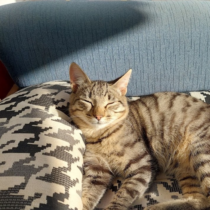
When we hover over the picture, the full image reveals itself. Notice that, the cutout does not affect bounding-box of the element, so even though we initially see only part of the image, for the purpose of the layout, it’s as if the image has clip-path at all.
Let’s get into the code:
<img src="/images/kitty.jpg" width="200" height="200" class="circle">
.circle {
    clip-path: circle(35%);
    transition: clip-path 300ms ease-out;
}

.circle:hover {
    clip-path: circle(100%);
}
We add the clip-path property and use the circle() function to create a circular cutout of the image. Then add a transition effect to the property and change it on mouse hover.
There’s more functions that we can play with, check the examples below:
.square {
    clip-path: rect(20% 80% 80% 20% round 10%);
    transition: clip-path 300ms ease-out;
    border-radius: 4px;
}

.square:hover {
    clip-path: rect(0px 200px 200px 0px);
}.triangle {
clip-path: polygon(50% 20%, 50% 20%, 20% 80%, 80% 80%);
transition: clip-path 300ms ease-out;
border-radius: 4px;
}
.triangle:hover {
clip-path: polygon(100% 0%, 0% 0%, 0% 100%, 100% 100%);
}.rhombus {
clip-path: polygon(50% 20%, 80% 50%, 50% 80%, 20% 50%);
transition: clip-path 300ms ease-out;
border-radius: 4px;
}
.rhombus:hover {
clip-path: polygon(0% 0%, 100% 0%, 100% 100%, 0% 100%);
}Pretty neat, right?
In the examples above, we used both the rect() and polygon() functions to create and transition from custom shapes.
There are other available functions, such as path(), albeit, more difficult to transition into, since you need to keep the same number of points and curves.
.heart {
    clip-path: path("M59.2969 107.724L94.5898 140.859C96.0547 142.234 97.9883 143 100 143C102.012 143 103.945 142.234 105.41 140.859L140.703 107.724C146.641 102.165 150 94.3677 150 86.2165V85.0773C150 71.3479 140.137 59.6416 126.68 57.3828C117.773 55.8901 108.711 58.8167 102.344 65.2198L100 67.5768L97.6562 65.2198C91.2891 58.8167 82.2266 55.8901 73.3203 57.3828C59.8633 59.6416 50 71.3479 50 85.0773V86.2165C50 94.3677 53.3594 102.165 59.2969 107.724Z");
    transition: clip-path 300ms ease-out;
    border-radius: 4px;
}

.heart:hover {
    clip-path: path("M18.5937 101.344L89.1797 167.242C92.1094 169.977 95.9766 171.5 100 171.5C104.023 171.5 107.891 169.977 110.82 167.242L181.406 101.344C193.281 90.2891 200 74.7813 200 58.5703V56.3047C200 29 180.273 5.71875 153.359 1.22656C135.547 -1.74219 117.422 4.07813 104.688 16.8125L100 21.5L95.3125 16.8125C82.5781 4.07813 64.4531 -1.74219 46.6406 1.22656C19.7266 5.71875 0 29 0 56.3047V58.5703C0 74.7813 6.71875 90.2891 18.5937 101.344Z");
}
Transition out
Hope you’ve enjoyed this short tour of CSS transitions with clip-path and that, hopefully, you learned something new.
There’s more to this, but this post has been in the oven for so long, that I just wanted to get it out. I’ll probably end up making a second part in the near future.
Look forward to it!